In the silent heart of every scientific breakthrough, a story waits to be told—a story often trapped in rows and columns of raw data. From cancer diagnostics to ancient burial customs, tabular data forms the backbone of modern science. But these tables, dense with numbers and names, are rarely intuitive. For many researchers, decoding them is a slow and frustrating process—one that separates insight from action.
Now, a team from the Institute for Artificial Intelligence in Medicine (IKIM) at the University of Duisburg-Essen has crafted a bridge across that divide. They’ve developed a new open-source tool named Datavzrd, which elegantly transforms complex tables into interactive, visually engaging HTML reports. No programming needed. No special software required.
Published in PLOS One, their work is more than a technical achievement—it’s a democratic leap for science communication, empowering experts and non-experts alike to interact with data in new, meaningful ways.
Why Tables Alone Are Not Enough
Imagine a spreadsheet detailing the genetic profiles of cancer patients. Each row is a life, each cell a clue. But to the untrained eye—and sometimes even to seasoned scientists—the meaning can be lost in the maze. Traditional data tables don’t allow for exploration. You can’t sort them easily. You can’t follow links. You can’t compare trends unless you manually rearrange them or use a separate program.
Researchers often turn to advanced tools like R Shiny or Plotly to make data interactive. But those come with their own barriers: coding skills, software dependencies, and a steep learning curve. This means that for many, especially in cross-disciplinary fields or resource-limited environments, data remains stuck in static form, like a song written in a forgotten language.
Enter Datavzrd—a tool built for scientists who know their data but don’t want to learn a programming language just to show it.
Simplicity Meets Sophistication
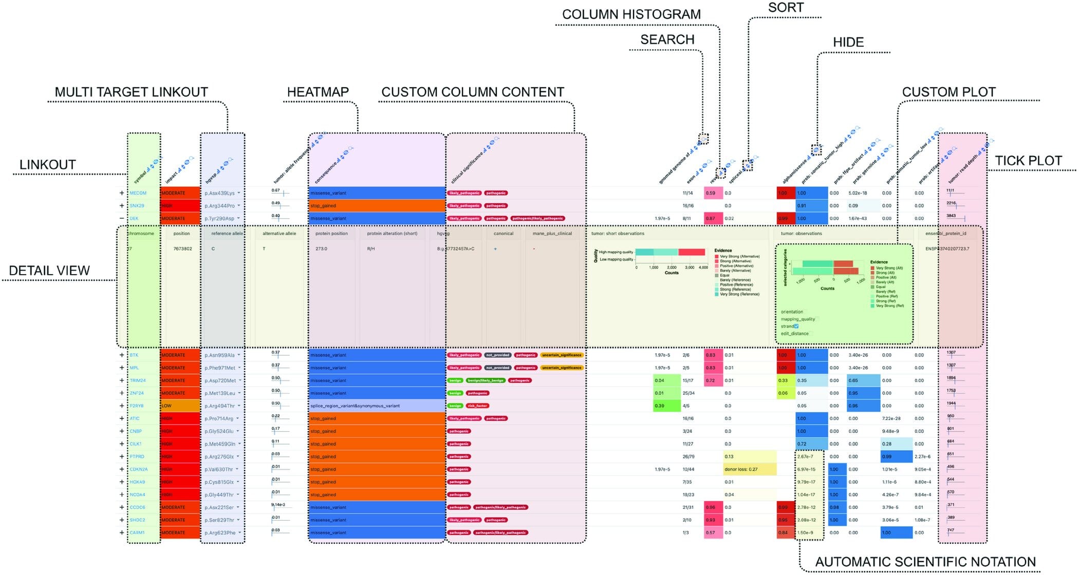
What makes Datavzrd revolutionary is its balance of power and simplicity. Instead of requiring code, it lets users define their data visualization through a plain-text configuration file—essentially a “profile” that describes how the data should look and behave. Based on that, the tool generates an interactive HTML report, complete with search, filters, sorting, linking, and even navigation across related tables.
“You don’t program the report,” says Felix Wiegand, a computer scientist on the development team. “You describe it. That’s a crucial difference. The learning curve is gentle, but the results are powerful.”
Because the reports are simple HTML files, they don’t need an internet connection or special hosting. They can be opened locally in a browser, sent as email attachments, or uploaded to a server. And remarkably, they remain smooth and responsive—even when dealing with millions of data rows.
The result is something almost magical: tables that breathe, that invite interaction, that tell stories instead of hiding them.
Crossing Disciplines, Connecting People
The IKIM team tested Datavzrd in diverse scientific arenas, proving its flexibility and impact. In one example, used in a molecular tumor board, the tool displays complex genetic data along with therapy options in a way that lets physicians instantly access and compare personalized patient information. What was once buried in static reports becomes a dynamic clinical resource.
In another, archaeologists used Datavzrd to catalog and compare decorated clothing artifacts from dig sites across Europe. The linked, interactive format allowed researchers to trace cultural patterns and historical timelines with ease—no longer limited by separate Excel files or manual cross-referencing.
By seamlessly mapping relationships between datasets—whether across genes, patients, artifacts, or timelines—Datavzrd makes cross-referencing second nature. It’s not just about viewing data; it’s about moving through it, intuitively.
“Datavzrd makes data-based results intuitive, flexible, and sustainable,” says Wiegand. “It is suitable for almost all disciplines and scientific fields—from research and teaching to evaluation.”
Open Science, Open Possibilities
A critical feature of Datavzrd is that it’s open source. This means any researcher, student, or institution can download and use it freely, modify it, or build on top of it. In an era where open science is not only ideal but increasingly essential, tools like this are game-changers. They help level the playing field and foster transparency.
The IKIM team also provides clear documentation and tutorials, helping even non-specialists get started quickly. With minimal setup, anyone can convert their tabular data into something vibrant and functional—something that speaks.
A Future of Interactive Insight
Datavzrd may not make headlines like a new vaccine or a telescope image of a distant galaxy. But in its quiet way, it enables those very discoveries to be shared, scrutinized, and understood more effectively. By transforming passive tables into dynamic tools, it enhances how scientists communicate—not only with one another, but with the world.
Science depends not just on discovering truth, but on expressing it clearly. And in this mission, Datavzrd shines—not with the brilliance of raw innovation, but with the steady glow of accessibility. It doesn’t just handle data. It gives it a voice.
Reference: Felix Wiegand et al, Datavzrd: Rapid programming- and maintenance-free interactive visualization and communication of tabular data, PLOS One (2025). DOI: 10.1371/journal.pone.0323079