On a clear night, the sky appears filled with countless stars. Some shine brightly, some seem faint, some glow with a bluish-white color, while others appear reddish or orange. To the naked eye, they may look like scattered points of light randomly spread across the heavens. Yet hidden behind that apparent randomness is a remarkable order.
For centuries, astronomers wondered whether stars followed patterns. Were all stars fundamentally the same, differing only in brightness because of their distance from Earth? Or were there different kinds of stars with different life stories?
The answer emerged in the early twentieth century through one of the most important discoveries in astronomy. Scientists found that stars could be organized in a way that revealed their physical properties, their stages of evolution, and even their ultimate fate.
This discovery became known as the Hertzsprung-Russell Diagram, often shortened to the H-R Diagram.
At first glance, the H-R Diagram looks like a simple graph. But its significance is extraordinary. It serves as a map of stellar evolution, helping astronomers understand how stars are born, how they live, and how they die.
Without the H-R Diagram, modern astrophysics would be almost impossible. It is one of the most powerful tools ever developed for studying the universe.
The Birth of a Revolutionary Idea
The story of the Hertzsprung-Russell Diagram begins during a period when astronomy was rapidly changing.
By the late nineteenth century, astronomers had begun using spectroscopy to analyze starlight. When light from a star passes through a prism or a spectroscope, it spreads into a spectrum of colors.
These spectra revealed that stars contained different chemical elements and possessed different temperatures.
Astronomers soon realized that stars could be classified according to their spectra. Some stars were extremely hot and blue. Others were cooler and red.
Yet an important question remained unanswered.
How did a star’s temperature relate to its brightness?
Two astronomers working independently would help solve this mystery.
One was Ejnar Hertzsprung from Denmark.
The other was Henry Norris Russell from the United States.
Both noticed that when stars were compared according to their temperature and intrinsic brightness, remarkable patterns emerged.
Instead of being randomly distributed, stars clustered into distinct regions.
This realization led to the creation of the Hertzsprung-Russell Diagram, a breakthrough that transformed astronomy forever.
What Exactly Is the Hertzsprung-Russell Diagram?
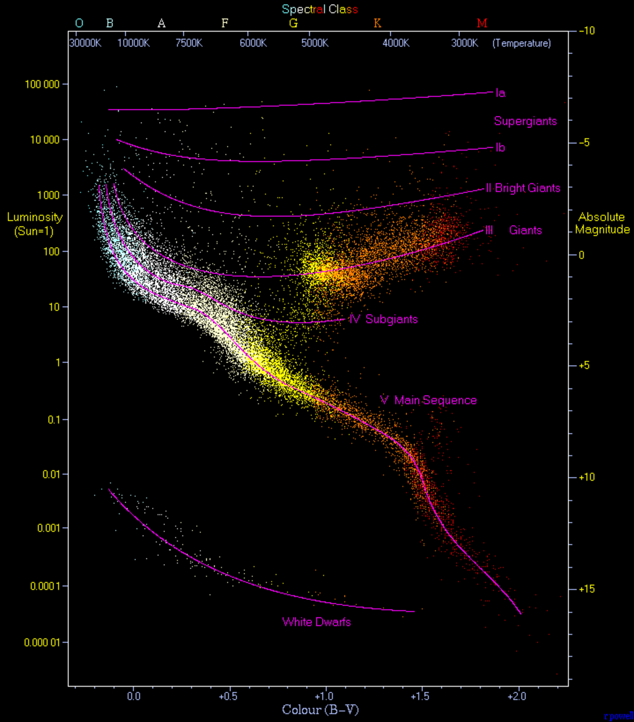
The Hertzsprung-Russell Diagram is a graph that plots stars according to two major characteristics.
One axis represents a star’s luminosity, which is its true brightness or total energy output.
The other axis represents temperature, or equivalently, spectral type.
By placing stars on this graph, astronomers discovered that most stars fall into specific groups rather than appearing randomly.
This simple diagram became a kind of stellar roadmap.
Every point on the graph represents a star.
The position of that star tells astronomers important information about its size, temperature, energy production, age, and evolutionary stage.
What makes the diagram so powerful is that it reveals relationships that are not obvious when observing stars individually.
A single star may seem mysterious.
Thousands of stars plotted together reveal a pattern.
Understanding the Axes
To appreciate the H-R Diagram, it helps to understand its axes.
The vertical axis usually represents luminosity.
Luminosity measures the total amount of energy a star emits every second.
The Sun is often used as a reference point.
A star with twice the Sun’s luminosity emits twice as much energy.
A star with one thousand times the Sun’s luminosity emits one thousand times more energy.
The horizontal axis represents surface temperature.
This is where the diagram becomes somewhat unusual.
Temperature decreases from left to right.
The hottest stars appear on the left side.
The coolest stars appear on the right side.
This arrangement may seem backward at first, but it developed from historical astronomical classification systems.
Stars on the left can have surface temperatures exceeding 30,000 degrees Celsius.
Stars on the right may have temperatures below 3,500 degrees Celsius.
Together, these two axes create a framework that reveals the hidden structure of the stellar population.
The Strange Relationship Between Color and Temperature
One of the fascinating aspects of stars is that their color reveals their temperature.
Most people associate red with heat because of glowing embers or flames.
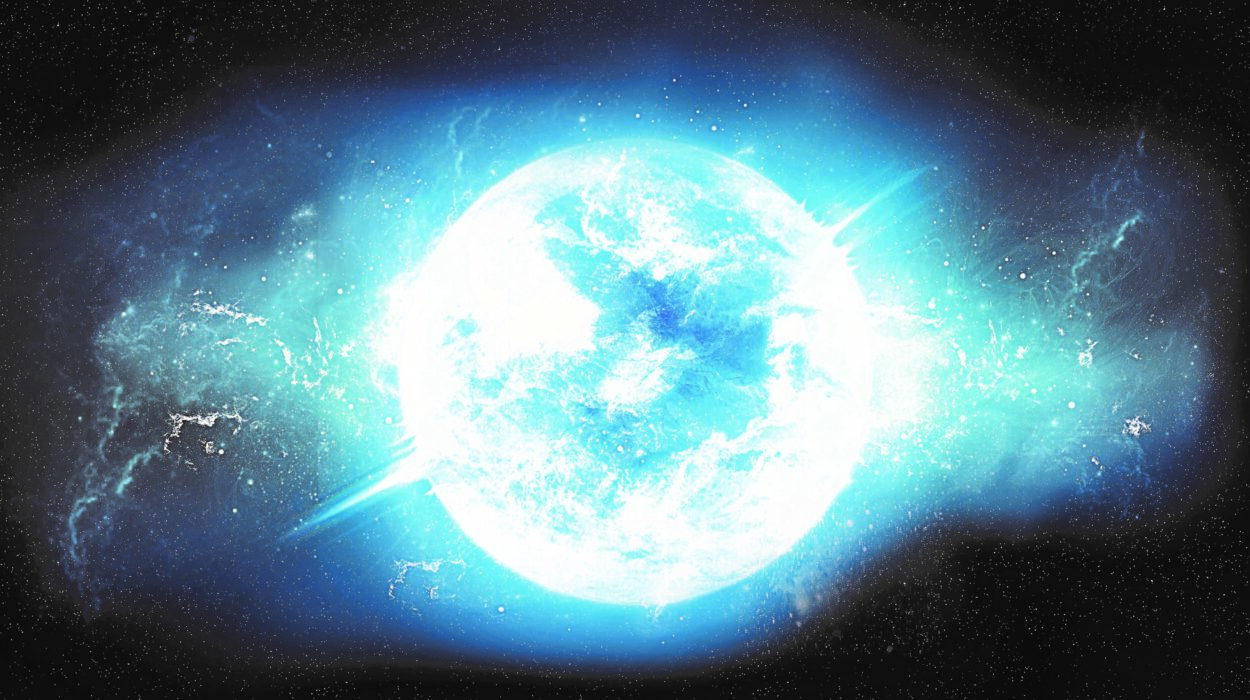
In astronomy, however, blue stars are hotter than red stars.
Extremely hot stars emit more blue and ultraviolet light.
Cooler stars emit more red and infrared light.
As a result, the hottest stars appear blue-white.
Stars with intermediate temperatures often appear white or yellow.
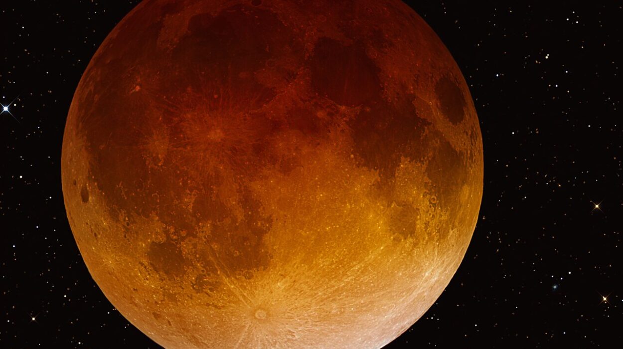
Cool stars tend to appear orange or red.
The Sun, for example, is classified as a yellow-white star.
Its temperature is about 5,500 degrees Celsius at the surface.
The color-temperature relationship plays an important role in the H-R Diagram because temperature helps determine where a star is placed.
The Discovery of Stellar Patterns
When astronomers began plotting stars on the H-R Diagram, something remarkable happened.
The stars did not scatter randomly across the graph.
Instead, they formed distinct patterns.
The most prominent pattern is a long diagonal band stretching from the upper left to the lower right.
This region is called the Main Sequence.
Most stars in the universe belong to the Main Sequence.
The Sun is one of them.
Other regions of the diagram contain giant stars, supergiant stars, and white dwarfs.
Each region represents a different stage in stellar evolution.
The diagram revealed that stars change over time and move through different parts of the graph during their lives.
In essence, astronomers had discovered a map of stellar lifecycles.
The Main Sequence: Where Most Stars Spend Their Lives
The Main Sequence is the most important feature of the H-R Diagram.
Approximately 90 percent of stars spend the majority of their lives in this region.
A Main Sequence star generates energy through nuclear fusion in its core.
Hydrogen atoms combine to form helium, releasing enormous amounts of energy.
This energy travels outward and eventually escapes as light and heat.
The balance between gravity and fusion keeps the star stable.
Gravity constantly tries to compress the star inward.
Fusion creates outward pressure.
When these forces balance each other, the star remains stable.
This stable period can last millions, billions, or even trillions of years depending on the star’s mass.
The Sun has been a Main Sequence star for approximately 4.6 billion years and is expected to remain in this phase for about another 5 billion years.
Why Mass Matters More Than Anything Else
One of the most important lessons from the H-R Diagram is that mass largely determines a star’s destiny.
Mass influences temperature.
Mass influences brightness.
Mass influences lifespan.
Mass influences how a star dies.
A massive star possesses stronger gravity.
This compresses its core more intensely.
The increased pressure raises temperatures and accelerates fusion reactions.
As a result, massive stars become extremely hot and luminous.
They appear in the upper-left region of the Main Sequence.
Smaller stars have weaker gravitational compression.
Fusion occurs more slowly.
These stars remain cooler and dimmer.
They appear in the lower-right region of the Main Sequence.
The relationship is so fundamental that astronomers often describe mass as the master property of stars.
Massive Stars Live Fast and Die Young
The H-R Diagram reveals a surprising truth.
The brightest stars do not live the longest.
In fact, the opposite is true.
Massive stars consume their nuclear fuel at astonishing rates.
Although they possess more hydrogen than smaller stars, they burn through it much faster.
Some massive stars exhaust their fuel in only a few million years.
That may sound like a long time, but compared with billions of years, it is incredibly brief.
These stars shine brilliantly but live short lives.
They are cosmic sprinters.
Their intense energy output places them near the upper-left portion of the Main Sequence.
Small Stars Live Remarkably Long Lives
Red dwarf stars occupy the lower-right region of the Main Sequence.
These stars are small, cool, and relatively faint.
At first glance, they may seem less impressive than giant blue stars.
Yet red dwarfs possess an extraordinary advantage.
They conserve fuel extremely efficiently.
Fusion occurs slowly.
As a result, red dwarfs can survive for hundreds of billions or even trillions of years.
This is longer than the current age of the universe.
In fact, the universe is not old enough for any red dwarf to have completed its full lifecycle.
Every red dwarf ever formed still exists today.
The H-R Diagram helps astronomers understand why these stars are among the most durable objects in existence.
The Sun’s Place on the Diagram
The Sun occupies a relatively ordinary position on the Main Sequence.
It is neither unusually large nor unusually small.
Neither exceptionally hot nor exceptionally cool.
Neither extremely bright nor especially dim.
In many ways, the Sun represents a typical star.
Its location on the H-R Diagram helps astronomers compare other stars to our own.
Because the Sun is studied in such detail, it serves as a benchmark for understanding stellar behavior.
The Sun’s position also tells us something about its future.
Like all Main Sequence stars, it will not remain in its current state forever.
Eventually, it will move to a different region of the diagram.
Leaving the Main Sequence
Stars do not spend eternity on the Main Sequence.
Eventually, hydrogen in the core becomes depleted.
Fusion slows down.
The delicate balance between gravity and pressure begins to change.
The star enters a new stage of evolution.
Its core contracts.
Temperatures increase.
The outer layers expand dramatically.
The star begins moving away from the Main Sequence on the H-R Diagram.
This transition marks the beginning of a profound transformation.
The star is entering middle age.
Its most stable years are ending.
A new chapter begins.
The Rise of the Red Giants
As stars exhaust core hydrogen, many evolve into red giants.
These stars become enormously larger than before.
Although their surface temperatures decrease, their immense size allows them to remain highly luminous.
On the H-R Diagram, red giants appear in the upper-right region.
This placement may seem surprising.
They are relatively cool stars, yet they are extremely bright.
The explanation lies in their enormous size.
Luminosity depends not only on temperature but also on surface area.
A giant star can emit tremendous amounts of energy because it possesses a vast surface.
Some red giants become hundreds of times larger than the Sun.
If one replaced the Sun in our solar system, it might extend beyond Earth’s orbit.
The Future of Our Sun
The H-R Diagram provides a glimpse into the Sun’s future.
Approximately 5 billion years from now, the Sun will exhaust hydrogen in its core.
It will leave the Main Sequence.
Its outer layers will expand dramatically.
The Sun will become a red giant.
During this phase, its size will increase enormously.
Mercury and Venus will likely be engulfed.
Earth’s future remains uncertain, but conditions will certainly become uninhabitable long before then.
Eventually, the Sun will shed its outer layers into space.
The remaining core will become a white dwarf.
This future path is clearly visible on the H-R Diagram.
Supergiants: The Titans of the Cosmos
Some stars evolve into supergiants.
These are among the largest and most luminous stars in existence.
Supergiants occupy the uppermost regions of the H-R Diagram.
Their immense brightness makes them visible across vast distances.
Some are blue supergiants, possessing extreme temperatures.
Others are red supergiants, characterized by enormous size and cooler surfaces.
One famous example is Betelgeuse.
Its diameter is hundreds of times larger than the Sun’s.
If placed at the center of our solar system, it could extend beyond the orbit of Mars.
The H-R Diagram helps astronomers identify these stellar giants and understand their evolution.
White Dwarfs: The Stellar Graveyard
One of the most fascinating regions of the H-R Diagram contains white dwarfs.
These stars occupy the lower-left portion of the graph.
At first glance, their position seems strange.
They are very hot but relatively dim.
The explanation lies in their size.
White dwarfs are incredibly small.
Most are roughly the size of Earth despite containing mass comparable to the Sun.
Because they have little surface area, they emit relatively little light even though their temperatures are extremely high.
White dwarfs represent the final stage of evolution for many stars.
The Sun will eventually become one.
They are essentially stellar embers slowly cooling over billions of years.
How the H-R Diagram Revealed Stellar Evolution
Before the H-R Diagram existed, astronomers understood relatively little about how stars changed over time.
The diagram provided crucial evidence that stars evolve.
Different regions corresponded to different stages of stellar life.
Instead of viewing stars as permanent and unchanging, astronomers began seeing them as dynamic objects with birth, growth, aging, and death.
The H-R Diagram turned scattered observations into a coherent story.
It showed that stars follow predictable evolutionary pathways.
This insight revolutionized astrophysics.
Star Clusters and Cosmic Clocks
One particularly powerful use of the H-R Diagram involves studying star clusters.
Stars within a cluster typically form around the same time.
This makes clusters ideal laboratories for understanding stellar evolution.
When astronomers plot cluster stars on an H-R Diagram, they can identify a feature called the turnoff point.
The location of this point reveals how many stars have left the Main Sequence.
This information allows astronomers to estimate the cluster’s age.
In effect, the H-R Diagram functions as a cosmic clock.
It helps determine whether a cluster is millions, billions, or even tens of billions of years old.
Variable Stars and the Diagram
Certain stars change brightness over time.
These variable stars often occupy specific regions of the H-R Diagram.
By studying their position, astronomers can learn important information about stellar interiors.
Some variable stars pulsate because of changes in temperature and pressure.
Others undergo dramatic eruptions.
The diagram helps researchers understand why these variations occur.
It also helps identify stars useful for measuring cosmic distances.
The H-R Diagram and the Search for Exoplanets
Although the H-R Diagram was developed long before exoplanets were discovered, it remains valuable in modern planet research.
Understanding a star is essential for understanding its planets.
A star’s temperature, luminosity, and age influence planetary conditions.
By locating a star on the H-R Diagram, astronomers can estimate whether nearby planets might possess environments suitable for liquid water.
The diagram helps place newly discovered planetary systems into context.
It remains an important tool in the search for potentially habitable worlds.
Modern Versions of the Diagram
Today’s astronomers have access to far more data than Hertzsprung and Russell could have imagined.
Space missions such as Gaia have measured the positions, distances, and properties of billions of stars.
Modern H-R Diagrams contain vast amounts of information.
Yet the fundamental idea remains unchanged.
Plot luminosity against temperature.
Observe the patterns.
Learn how stars live and evolve.
More than a century after its creation, the diagram remains central to astrophysical research.
Why the H-R Diagram Is So Important
Many scientific tools help researchers understand nature.
Few have had the transformative impact of the Hertzsprung-Russell Diagram.
Its power comes from simplicity.
Two basic measurements reveal profound truths.
The diagram helps determine stellar ages.
It helps estimate masses.
It helps predict future evolution.
It helps identify unusual stars.
It helps explain the history of galaxies.
It helps reveal the structure of the universe itself.
In astronomy classrooms around the world, students encounter the H-R Diagram because it provides one of the clearest windows into how stars work.
The Diagram That Turned Dots Into Stories
Before the H-R Diagram, stars often appeared as isolated points of light.
After the diagram, each star became part of a larger narrative.
Astronomers could see where a star came from.
They could understand what stage of life it occupied.
They could predict what would happen next.
A blue giant became a young powerhouse racing through fuel.
A red giant became an aging star approaching its final chapters.
A white dwarf became the remnant of a once-brilliant sun.
The diagram transformed stars from simple objects into evolving characters in a cosmic story.
Conclusion
The Hertzsprung-Russell Diagram is far more than a graph. It is one of humanity’s greatest achievements in understanding the universe. By plotting stars according to their luminosity and temperature, astronomers uncovered hidden patterns that revealed the lifecycle of stars.
From the stable years of the Main Sequence to the dramatic transformations of red giants and supergiants, from the enduring lives of red dwarfs to the quiet cooling of white dwarfs, the H-R Diagram provides a roadmap through stellar evolution. It shows how mass shapes destiny, how stars change over time, and how the cosmos continuously renews itself.
More than a century after its creation, the Hertzsprung-Russell Diagram remains one of the most important tools in astronomy. It helps scientists study distant galaxies, estimate stellar ages, understand planetary systems, and explore the history of the universe.
Most importantly, it reminds us that every star has a story.
The tiny points of light scattered across the night sky are not random decorations. They are living chapters in an immense cosmic drama—each following a path that can be traced on the remarkable map known as the Hertzsprung-Russell Diagram.