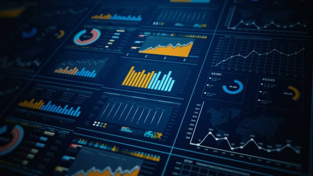
A dashboard is not simply a visual decoration for data; it’s a decision-making engine disguised as a collection of graphs, charts, and metrics. In the age of information overload, where businesses drown in endless streams of raw numbers, a well-built dashboard is like a lighthouse guiding leaders toward clarity. It tells a story at a glance, condensing millions of data points into an actionable narrative.
The human brain processes visual information far faster than text. A spreadsheet with 10,000 rows might take hours to interpret, but a dashboard can illuminate trends, risks, and opportunities in seconds. This speed isn’t just a convenience — it’s a competitive advantage. The faster an organization can understand its environment, the faster it can act.
Yet not all dashboards are created equal. Many look beautiful but fail to inform, and others are packed with so much clutter that they confuse rather than clarify. Building a dashboard that truly drives decisions is part art, part science, and part empathy for the people who will use it.
The Psychology Behind Dashboard Design
Before diving into tools and techniques, it’s important to understand the human element of dashboards. At their core, dashboards are designed for people — analysts, executives, sales managers, doctors, teachers — each with unique mental models and decision-making styles.
Cognitive psychology teaches us that attention is limited. A cluttered dashboard competes for mental bandwidth, forcing users to search for meaning instead of instantly seeing it. Decision fatigue sets in when too many elements scream for attention at once.
Good dashboard design works with the brain, not against it. It draws the eye naturally from the most important metric to the supporting details. It uses color purposefully — not as decoration but as a signal. It avoids unnecessary ornamentation that might distract from the insights. The ultimate goal is to minimize cognitive friction, letting decision-makers glide from data to decision without hitting mental roadblocks.
Defining the Dashboard’s True Purpose
Every great dashboard begins with a question: “What decisions will this help someone make?” The worst dashboards are built without this guiding question, becoming graveyards of disconnected charts. The best dashboards are laser-focused on a clear purpose.
Consider a hospital’s emergency department dashboard. It might track patient wait times, available beds, triage status, and incoming ambulance alerts. Every metric and visualization would be chosen to help staff make immediate, life-saving decisions. A marketing campaign dashboard, on the other hand, might emphasize real-time ad performance, lead conversion rates, and cost-per-acquisition trends — all tailored for optimizing spend and creative assets.
Purpose is the filter that determines what belongs and what doesn’t. Without it, even the most advanced visualizations are just noise.
Knowing Your Audience
An effective dashboard designer is a translator — someone who takes raw data and converts it into a language the audience understands. That means you need to know who will use the dashboard and how they will interact with it.
Executives often need high-level summaries that reveal trends and exceptions, with the ability to drill down when necessary. Data analysts might want detailed tables, statistical views, and the freedom to filter endlessly. Operational staff may need real-time alerts and highly visual cues to act instantly.
Ignoring the audience’s needs results in dashboards that frustrate more than they empower. Imagine handing a CFO a dashboard filled with raw SQL query results or giving a call center rep a chart of long-term industry growth rates. Relevance is everything.
Choosing the Right Data Sources
The magic of a dashboard lies not just in how it looks but in the reliability of its data. If the numbers are wrong or outdated, the dashboard becomes a dangerous illusion. Choosing the right data sources — and ensuring they are trustworthy — is a foundational step.
Data freshness matters. For a stock trading platform, a five-minute delay could mean millions lost. For an annual HR turnover analysis, monthly updates might suffice. Matching data latency to the decision-making needs of the user prevents frustration and ensures the dashboard’s credibility.
It’s also essential to avoid overloading the dashboard with every available metric. More data does not mean more clarity. Relevance and accuracy always outweigh volume.
Crafting a Story from Data
Data storytelling is the bridge between numbers and action. A dashboard that drives decisions doesn’t simply display figures — it weaves them into a narrative. It might show a sudden spike in website traffic, followed by a drop in bounce rate and a rise in conversions, leading to the conclusion that a recent content update worked brilliantly.
Story-driven dashboards guide the viewer’s journey. They answer implicit questions: What happened? Why did it happen? What might happen next? The visual layout should reflect the flow of this narrative, making the story obvious without a single spoken word.
Balancing Simplicity and Depth
One of the greatest challenges in dashboard design is striking the balance between simplicity and depth. A minimalist dashboard might be visually pleasing, but it risks omitting context that decision-makers need. An overly complex dashboard may include every detail imaginable but overwhelm the user.
A solution is to design in layers. The top layer presents essential metrics — the heartbeat of the system. Beneath that lies the ability to drill down into detailed reports. This way, the dashboard serves both quick decision-making and deeper analysis without forcing users to choose between them.
Choosing the Right Tools
The tools you choose to build your dashboard can shape both the process and the outcome. Platforms like Tableau, Power BI, Looker, Qlik Sense, and Google Data Studio each have strengths suited to different use cases. Some excel in interactive visualizations, others in scalability, and others in ease of use for non-technical teams.
The best tool is the one that fits your data environment, technical skills, and audience needs. For a startup with limited IT resources, a cloud-based, user-friendly tool might be ideal. For an enterprise integrating multiple massive data sources, a more robust platform with advanced analytics capabilities might be necessary.
The Role of Interactivity
A static dashboard can inform, but an interactive dashboard can engage. Filters, drilldowns, time range selectors, and clickable visual elements allow users to explore the data and find answers to their own questions.
Interactivity turns a dashboard from a passive display into an active investigation space. It invites curiosity — “What happens if I look only at last quarter?” or “How does this trend differ in different regions?” — and curiosity is the fuel of better decision-making.
Designing for Real-Time Decision Making
In some industries, speed is everything. Dashboards in manufacturing, logistics, emergency response, and financial trading must deliver real-time data. Delays can cost money, safety, or lives.
Real-time dashboards require more than just frequent data updates. They need clear visual alerts, intuitive color coding, and a layout that makes urgent information impossible to miss. If something goes wrong, the user should see it instantly and know exactly what action to take.
Avoiding the Trap of Vanity Metrics
One of the most dangerous temptations in dashboard building is filling it with numbers that look good but don’t lead to action. Vanity metrics — like total page views without context, or raw social media likes without engagement rates — can give a false sense of success.
A decision-driving dashboard focuses on metrics tied directly to goals. If the goal is customer retention, the dashboard should highlight churn rates, customer satisfaction scores, and repeat purchase behavior — not just total signups.
Color, Contrast, and Visual Hierarchy
The visual language of a dashboard speaks as loudly as the numbers. Colors should guide attention, not compete for it. Red should mean something urgent or negative; green should signal something positive. Consistency builds familiarity, and familiarity speeds understanding.
Visual hierarchy — arranging elements so the most important stand out — is critical. Larger fonts, bolder colors, and prime screen positions should be reserved for the metrics that matter most. Supporting details belong in less dominant positions.
Testing and Iterating
A dashboard is never truly finished. The first version is a hypothesis: “I think this will help people make better decisions.” The only way to know is to test it in the real world.
User feedback is gold. Watching someone interact with the dashboard reveals blind spots you might never see otherwise. Are they ignoring a key metric? Struggling to find a filter? Misinterpreting a chart? These observations guide improvements.
Over time, a dashboard should evolve with the organization’s needs. As priorities shift, so should the metrics and design.
The Human Element of Trust
A dashboard can have flawless design and cutting-edge technology, but if users don’t trust it, they won’t use it to make decisions. Trust comes from consistent accuracy, transparent data sources, and clear definitions of metrics.
If “conversion rate” means one thing to marketing and another to sales, chaos will follow. Agreeing on definitions and documenting them prevents misunderstandings and strengthens trust.
From Dashboard to Decision
The ultimate measure of a dashboard’s success is not how many people open it, but how many decisions it influences. Does it lead to better strategies, faster responses, higher efficiency, or greater profits? Does it help prevent mistakes? Does it empower rather than overwhelm?
When a dashboard becomes part of the organization’s daily rhythm — when people instinctively turn to it before making a choice — it has fulfilled its purpose.
The Future of Decision-Driven Dashboards
Dashboards are evolving beyond static visualizations into intelligent systems. Machine learning and AI are enabling predictive dashboards that don’t just show what happened, but forecast what will happen. Automated alerts, natural language queries, and voice-activated insights are becoming more common.
Yet the essence remains unchanged: a dashboard must tell a clear, truthful story and guide decisions. Technology can amplify that purpose, but it cannot replace it.
Closing Thoughts: The Dashboard as a Compass
A great dashboard is like a compass in a storm — it doesn’t make the decisions for you, but it points you in the right direction with clarity and confidence. It is a tool of focus in a noisy world, a translator of complexity into simplicity.
When built with purpose, empathy, and precision, a dashboard is more than just a report. It is the beating heart of a data-driven culture, the silent partner in every great decision, and a bridge between information and action.


